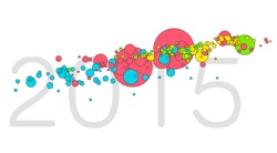
Gapminder is an organization promoting sustainable global development by encouraging the use and understanding of statistics and other information about social, economic and environmental development at local, national and global levels.
Basically it’s a tool you and kids can use to compare and contrast countries around the world. So . . . teaching geography, world history, economics, comparative government? GapMinder is a tool you and your kids need to be using.
At GapMinder, you can access a variety of tools, lesson plans, and videos that help students understand the world and can help you generate a wide range of problems for your kids to solve.
One example of a lesson plan that uses GapMinder data can help your kids to think about the gaps in the world today and challenge their preconceived ideas about how the contemporary world looks. The exercise can also be used to stimulate an interest in using statistics to understand the world.
How to use the activity:
1. Divide your class into groups with 3-5 students in each group.
2. Prepare the material. The following material will be used:
- The 16 “country cards” (Find these in the PDF version of the lesson below). Distribute one set of cards to each group.
- An ordinary world map, if you have one. This is not essential but it is useful to help students get a better sense of where in the world the countries on the cards are.
- The graph “Gapminder World Map” (Available in the same PDF lesson plan below. The lesson plan uses a 2010 version – I’ve included a PDF of the 2012 version as well). Print one graph for each group but don’t distribute them yet.
3. Ask students to arrange the country cards according to the development level of the countries. You should be intentionally vague about what you mean by “development level” and let the students come up with their own ways of sorting. (e.g. they might sort them into two groups, several groups, or arrange them into one line).
4. Ask them to explain how they arranged the cards. Does their way of sorting the countries reflect what they think the incomes of the countries are? Health? Military? “Development” in a more vague sense?
5. Give each group a copy of the “Gapminder World Map” graph. Explain the graph, i.e. that each bubble is a country, the size of the bubble is the population, the color the continent, the Y-axis is the life expectancy (i.e. health) and the X-axis is income per person. Explain quickly what the two indicators mean.
6. Ask them to find and mark the 16 countries on the graph.
7. Discuss whether there were any surprising results. Discuss whether the graph could be used to divide the countries of the world into different categories.
8. This should lead to a writing prompt or product creation activity that uses a powerful compelling question:
- Would all people around the world use the same definition for the word “developed?”
- Why are the most “developed” countries in certain parts of the world?
- What might cause that to change?
- What is the “best” place in the world to live?
Get the full version of the lesson plan with country cards and GapMinder Map. The 2012 version of the map uses their latest country data. And don’t be afraid to use the online version if you’ve got the tech. (They have an Alpha version that you might try.) You may want to download and pass out the GapMinder World Guide that walks you and students through the online version.
Use GapMinder along with other data crunching sites such as: